A BRIEF HISTORY OF FROT DESIGN We first designed a website for Cycle Services in 1998 - the original site is still online and looks pretty much the same as it ever did. We like purple. Despite being designed in 24 hours from a "Frontpage in 24 Hours" book, it looked OK and was very popular in it's day. If it hurts your eyes buy some shades.
These days www.frot.co.nz is just a portal to our own sites that we keep on our server. We don't do sites for clients. We are pretty slack about updating our own webpages, and have over 350 pages that need a good tidy up - please get in touch if you are a better webmaster than we are, and are willing to work for organic dairy products and cod liver oil...
DESIGN PHILOSOPHY Despite being relics from a previous century, it never hurts to have an opinion, so here's a few:
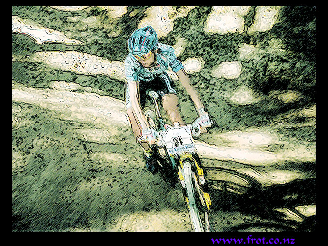
PICTURES More is more - back in the 90's when people used dial up connections we had to limit the amount of pictures we used per page to keep the pages loading, but now pictures load so fast there's no reason not to have dozens of them on every page. And decent sizes too - why mess about with puny little images and thumbnails? - google images is the new google.
SIMPLICITY Ideally, use a short memorable one syllable domain name. Less is more. Have no frames, and distill ideas down to the most important concept. Use a table with one column. Never have side menus. Include images, and write in short sentences. Now that tablets and phones are rapidly becoming the dominant mode of web surfing, all forms of complexity in websites, including side bars, drop down menus, and animations, are just old school clutter that can be binned. Tablets are the best thing to ever happen to websites! Have nothing that loads up slowly, like flash files, or multiple pages for the same topic, because waiting is boring. Let the page load while the viewer is looking at the top of the page. Make the links big, suitable for fat finger tips on tablets, and use simple logical menus with no drop downs, because they bugger up easy navigation.
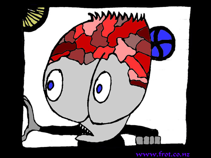
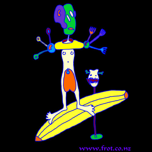
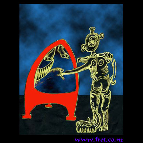
COLOURS The more primary and vivid the better, because a white background with black font might as well be a book, and grey sucks the very life out of peoples minds. In a world in which many people are afraid to express themselves with colour, (Or with anything at all really) there is no reason why the internet has to blend in. Whatever colours you choose someone will hate them - unless you choose grey of course, nobody hates grey...
DO IT YOURSELF Sometimes it's worth paying someone else to sort out your site, but like many things, web design has grown into a giant and mysterious subject dominated by "experts" - thankfully blogs did a lot to reverse that, and now most people just post their crap on facebook where it disappears without trace in a few days. 99% of the time no knowledge of "code" (html) is required at all to make a fully functional website. It's not that hard, and very few people other than web geeks take much notice anyway - it either works or it doesn't
LEAVE GAPS Each idea benefits from being separated by a space - an entire paragraph in one go is far too many words for a person running in information overload mode. Often any more than three lines of text without a space is overload. Time for a picture!
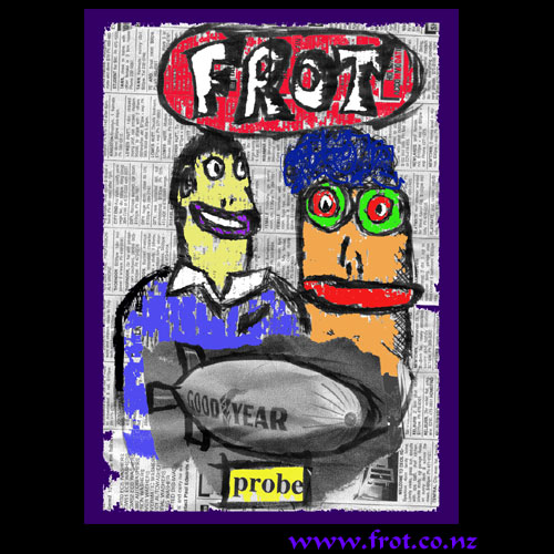
WHAT IS FROT? We do get asked this from time to time, and notice that some people are afraid to even utter the word. Maybe they think it means something pervy or deviant. Well actually...
WHO DID THIS STUFF? Frot Design is the work of Ian Gregson and Deb Gully.
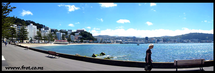
WHERE ARE WE? Wellington, New Zealand
|